
UI | UX CASE STUDY 2023


A responsive web app, streamlining the road-trip planning process.
I chose to create something that I wish existed- a tool to simplify planning road trips. As an avid road-tripper, I saw this as a great opportunity to streamline this process. During my time road-tripping, I’ve learned about a lot of pain points that come along with life on the road. That’s why I felt this was my chance to create a solution to the issues that I’ve encountered.
The Driving Force
Issues
• Decentralized information (ie: using multiple apps, spreadsheets, pen & paper, etc.)
• Analog budgeting leading to inaccurate & inconsistent budgeting
• Difficulty sourcing unique destinations & accommodations
• Route planning for multiple destinations is clunky
• No routing options for scenic/off-the-beaten-path routes
Solutions
• One consolidated tool (ie: browse, search, plan, budget, book, navigate)
• Cost estimates (ie: gas, tolls, accommodations, activities, etc.)
• Browse, search, save, and share recommendations (ie: destinations, guides, accommodations, restaurants, activities, etc.)
• Browse, create, save, and share thorough travel itineraries

Process
-
Competitor Research | Analysis | Hypothesis | Objectives
-
user interviews | User Personas
-
MVP | Jobs to be done | User Flow | Low-Fi Sketches
-
Rapid Paper Prototype | User Testing
-
Wireframes | Style Guide | Responsive Screens

Exploration
While I have knowledge of many existing travel apps, research is key to the UX process. In order to gain more knowledge of the space, I did a deep dive into Roadtrippers and Airbnb. I utilized SWOT analysis and Heuristic/UX analysis, by doing so I was able to compare the two apps and identify strengths and weaknesses. This gave me a better understanding of how I can provide the best user experience possible & set a foundation for what features I would like to incorporate in my design.
Understand the competition
Competitive
Analysis

STRENGTHS
Dynamic
• Either plan your own trip or get inspired by pre-planned road trips.
In-app navigation
• Users have the option to use navigation of their preference.
Hyper-specific
• Niche expertise with filtering options

WEAKNESSES
Limited coverage
• Only available in the US, Australia, Canada, and New Zealand.
No trial, high subscription
• $29.99/year with no trial
• Free version is very limited
Limited Searching Abilities
• Not able to search trip guides

OPPORTUNITIES
Expand User-base
• Provide worldwide coverage
Revenue Model
• Lower subscription price
• Free Trial
In-depth budgeting tools
• Budgeting options for every step of the way, not just gas.
User-base Content
• Guides written by users, are more authentic than those coming from a sponsor.

THREATS
Price Point
• Roadtrippers is the most expensive map app out there, most of their competition is free.
Limited Demographic
• Very niche expertise
• Competitor map apps function globally
• Other forms of travel such as air or train are not incorporated.

After conducting research and analyzing the data, I was able to determine where improvements could be made and what I believe my users would want & need. I created a hypothesis and objectives to align with my goals and my users’ wants and needs.
Exploration
Determine Users wants & needs

Hypothesis
Users want a consolidated solution for planning, navigating, and budgeting road-trips & travel plans.
-
• People who travel and/or take road-trips.
• People who are looking for unique experiences.
• People who are looking for a simple tool to plan and budget travel.
-
• Browse, search, plan, budget, book, & navigate travel plans in one solution.
• Browse, search, save, and share recommendations (ie: destinations, guides, accommodations, restaurants, activities, etc.)
• Browse, create, save, share through travel itineraries.
• Estimate costs (ie: gas, tolls, accommodations, activities, etc.)
-
• All in one travel planning tool.
• More accurate budgeting tools.
• Unique content tailored to users looking for uncommon destinations.
• Various routing options (ie: the scenic route, off the beaten path, etc.)
-
Browse/Search
• Region
• Activities
• Destinations
• Guides
Plan
• Create, save, and share itineraries
• Utilize guides for suggestions
• Book accommodations direct
• Navigation options
Budget
• Gas & toll estimates based on vehicle and route
• Cost estimates for accommodation and activities
• Filter results by a specific budget
• Estimated cost for pre-planned guides
-
• Anywhere, either at home or on the road on any device.
• On or off-line with downloaded maps and guides.
Objectives

Once I determined my hypothesis and objectives, I conducted user interviews to test my theory. This gave me the ability to see if my preconceived assumptions and learnings from my research aligned with what potential users want & need. I was able to gain perspective from potential users to get a better understanding of user needs, wants, and pain points. This process gave me valuable insight into the essentials needed for my travel app.
Empathize
learn users wants & needs

How often do you travel? How do you find new places? What sites or apps do you utilize to plan travel?
How often do you travel? How do you find new places? What sites or apps do you utilize to plan travel?
What kind of travel do you plan? How do you save trips you're planning? What's the most frustrating things when you plan travel?
What kind of travel do you plan? How do you save trips you're planning? What's the most frustrating things when you plan travel?
I conducted one on one user interviews with three different potential users. These were controlled interviews, all participants were asked the same questions. Despite being in different demographics and having different goals, all of the interviewees had commonalities that align with the goal of Off Beat.
User Interviews
Synthesis
Regardless of travel plans, a user ends up using multiple resources in order to plan travel.
Lots of time is spent on research on travel plans.
Budget is top of mind, yet most people just wing it.


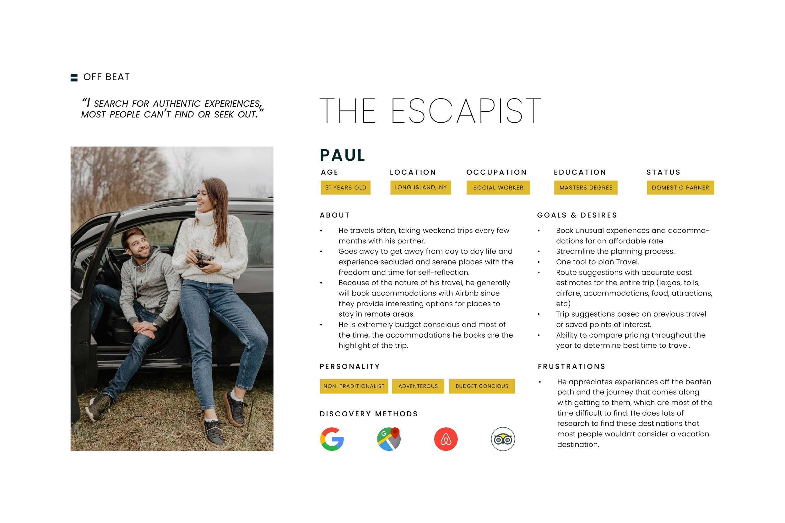
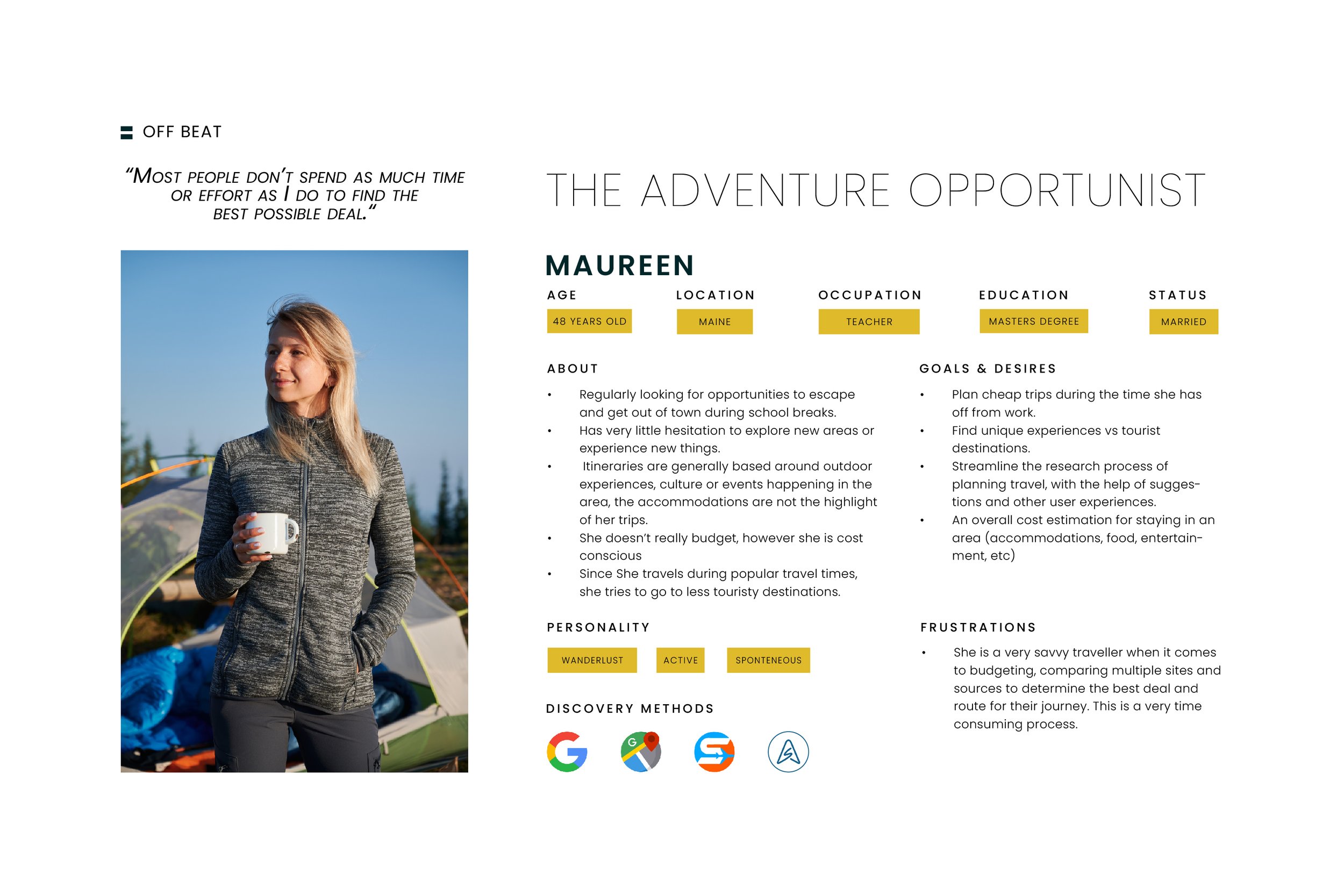
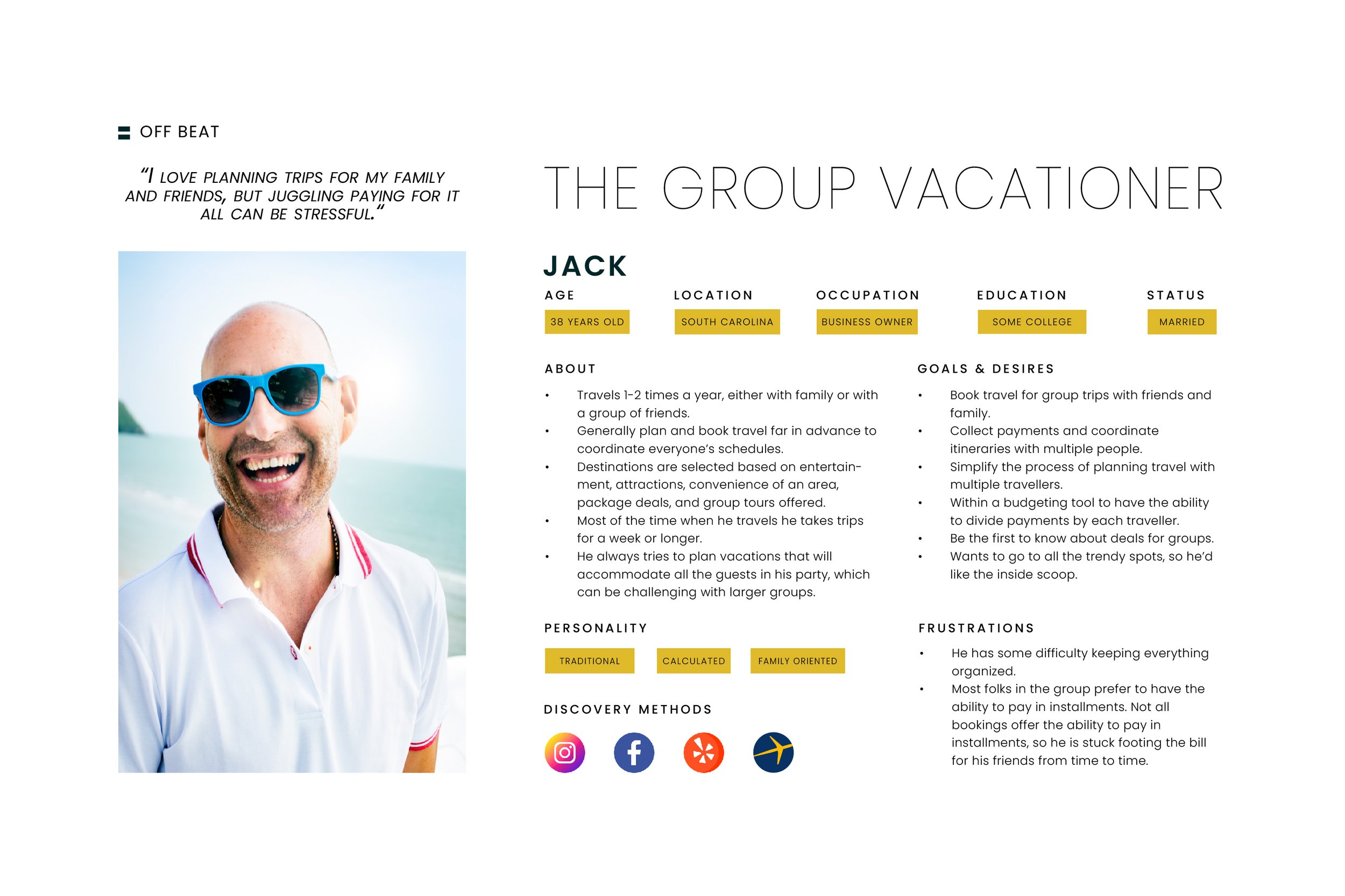
After I conducted my initial interviews and gathered my survey results, I analyzed the data and identified similarities in needs, goals, and behaviors among users. After analyzing the data, I was able to create three user personas and scenarios of potential users of Off Beat.
empathize
Who are my users?

Imagine
Now that I had done my “homework” aka competitive research & analysis, created a hypothesis and objectives, conducted user interviews, and created user personas, I was ready to start the next phase of the design process- ideate. I started by gathering requirements that would align with user desirability, business viability, and technical feasibility. I took these preliminary ideas and created Jobs To Be Done, and prioritized certain features based on how crucial they were to my users and business objectives. I took this information and consolidated it into an MVP and multiple sprints.
Conceptualize ideas

mvp objective
simplify the process of planning road trips with one consolidated tool.
Jobs to be done
1
When discovering locations, I want the ability to use geo-location so I can find places near me / near an area I am researching.
Rationale: Users will have the ability to find destinations or points of interest on the fly, by streamlining the research process.

2
When planning travel, I want to research where I am going, so I can tailor my experience to fit my goals.
Rationale: Users will use this product to get exclusive insight and gain trust by taking advice from active users.

3
When I am traveling, I would like to use the same tool for navigation (on or off-line), so I don’t need to juggle multiple apps and can still navigate when I am in areas of limited service.
Rationale: By having saved destinations in the app and having in-app navigation, will make this process much simpler for the user. Off-line maps can be crucial when off the beaten path and are sometimes difficult to acquire.


imagine
Now that I had determined what my users’ needs and wants were and how those requirements translated into specific Jobs To Be Done, next was to step into the shoes of the user. By creating a user flow, I was able to dictate how my users are actually going to experience the product and how they will complete the tasks outlined. By creating a single user flow diagram, I was able to visualize the user journey & fill in the gaps if necessary.
Map out the user experience


imagine
The next step was to generate and iterate ideas on paper, by doing exploratory mobile-first design sketches. I utilized Crazy 8’s method, which gave me the ability to design multiple screens in a short period of time. Once you get into a creative groove, sketching fast helps get the ideas out of your head and onto paper. After completing sketches for all of the Jobs To Be Done I had outlined, I selected the screens that I would like to utilize by dot voting on each screen. This whole process helped streamline the task of going from sketching to a workable low-fidelity prototype.
Bring the ideas to life on paper


Test
The next cycle of the design process is to prototype & test! I compiled my dot-voted sketches from my Crazy 8’s sessions and combined these sketches to create a user flow for each of my Jobs To Be Done. Then I took my static screens and turned them into an interactive rapid prototype to test with potential users. By creating an interactive prototype and verifying it early on in the design process, I was able to expedite the development of my designs and get feedback quickly. Involving users at an early stage also enabled me to ensure that my designs meet the needs of users and tackle the identified problems effectively.
Validate MVP & Prototype
Rapid Prototype
Rapid Prototype

Design
The next step was to take my paper sketches and bring them to life on a screen. I took my low-fidelity wireframes and digitized them in Adobe XD. Since I took the mobile-first approach to my design process, I also designed responsive designs for various breakpoints. All screens were designed with a 12-column grid system, across all responsive screen sizes.
Sketches to screens
wireframes

Low-Fidelity

Mid-Fidelity

High Fidelity

Design
Now that I had developed wireframes for numerous breakpoints and screens, the next step in my design process was to define a style guide for my app. I compiled a mood board, reviewed other style guides, and browsed other web apps to gain inspiration. I defined a style for the key components of my app. By doing so I created a style guide to create consistency.
Establish the creative direction
Color
-

Muted Emerlad
HEX: #6D8F7E
-

BERRY PINK
HEX: #BD4C86
-

MUSTARD
HEX: #DEBA2B
-

ORANGE
HEX: #E09A31
-

EGGPLANT
HEX: #57485B
-

DUSTY BLUE
HEX: #94C1EB
-

SKY BLUE
HEX: #94C1EB
-

WHITE
HEX: #FFFFFF
-

GRAY
HEX: #707070
-

BLACK
HEX: #000000
Typography


Icons
-

Navigation
-

Categories
-

Etc. Color

BUTTONS & INPUT


Imagery


Design
Once I had my creative direction outlined in my style guide, I applied those UI styles to my responsive screens. I shared my work for review and critique, which gave me valuable insight and a different perspective on how I can improve my designs. I organized and categorized the feedback received, then prioritized which suggestions should be implemented, discarded, or saved for a later date. Based on this feedback I updated my style guide and implemented necessary design changes across all responsive screen sizes.
Turning feedback into action items
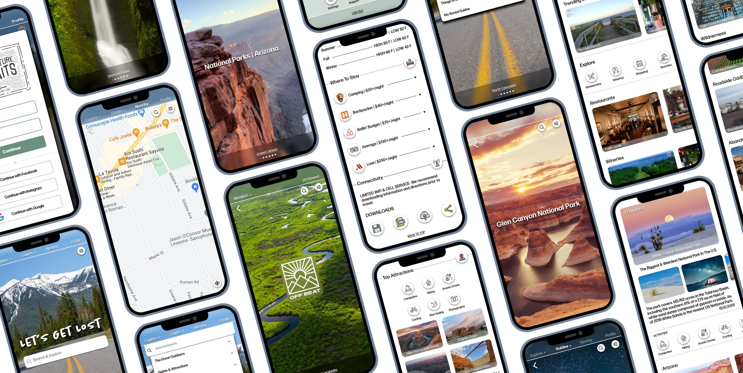
Based on my prioritized list of changes to be done, I made design revisions accordingly. The main focus for these first alterations was to ensure usability and readability
Finalizing designs

Final Designs

Discover
Unforgettable Destinations


NAVIGATE THE UNKNOWN
WITH OUR COMPREHENSIVE GUIDES & PREPLANNED ROUTES.
GET OUT OF YOUR COMFORT ZONE
AND EXPLORE UNIQUE OFF-THE-BEATEN-PATH DESTINATIONS.


Your personal
travel guru


WE PROVIDE YOU WITH PERSONALIZED TIPS & SUGGESTIONS
TO ENSURE EVERY STOP ON YOUR TRIP IS UNFORGETTABLE.
IF YOU NEED HELP NAVIGATING, DON’T WORRY-
WE’VE GOT YOUR BACK IF YOU NEED SOME GUIDANCE!
KNOWLEDGE IS POWER,
SO WE DO THE RESEARCH SO YOU CAN LOOK LIKE THE EXPERT.


SAY GOODBYE TO TEDIOUS PLANNING!
WITH OFF BEAT, YOU CAN PLAN YOUR ROAD-TRIP HASSLE-FREE
FROM ANYWHERE, ON ANY DEVICE.
OUR APP SIMPLIFIES THE ENTIRE PLANNING PROCESS,
SO YOU CAN FOCUS ON THE FUN PARTS OF YOUR ADVENTURE.
Planning Made easy



Thank you
Thank you
PROJECT ROLE & TOOLS
MARKET RESEARCH
|
COMPETITIVE ANALYSIS
|
USER INTERVIEWS
|
USER PERSONAS
|
USER FLOW
|
PROTOTYPING
|
USER TESTING
|
WIREFRAMES
|
STYLE GUIDE
|
INTERFACE DESIGN
|
MARKET RESEARCH | COMPETITIVE ANALYSIS | USER INTERVIEWS | USER PERSONAS | USER FLOW | PROTOTYPING | USER TESTING | WIREFRAMES | STYLE GUIDE | INTERFACE DESIGN |

Before you hit the road…
Looking for a designer or have feedback?
Let’s chat!

