


UI | UX CASE STUDY 2023
UNlock your creativity-
with the ultimate Art E-learning app!
What is muse?
Muse is a revolutionary art e-learning app designed to ignite creativity and inspire learning in users of all skill levels. This app is an interactive platform that offers a comprehensive art education experience, providing users with a wealth of resources to develop their artistic abilities. Whether you’re a beginner looking to learn the basics or an experienced artist seeking to refine your skills, Muse has something to offer you.
Problem
The current landscape of e-learning apps lacks a focused platform for crafting/art, resulting in poor quality or difficult-to-access tutorials that often lead users to external sites cluttered with ads and distractions, leading to user frustration and potentially resulting in subpar project outcomes.
Solution
An e-learning art app, providing a comprehensive and user-friendly platform that caters exclusively to crafting and art education, delivering high-quality tutorials, user-friendly interface, and a vibrant community to inspire and educate users of all skill levels, resulting in successful project outcomes and a positive user experience.


Research
•
User experience
•
Ideate & Sketch
•
Wireframing
•
Prototype
•
Test
•
Reiterate
•
Research • User experience • Ideate & Sketch • Wireframing • Prototype • Test • Reiterate •
• PROJECT APPROACH •
Research
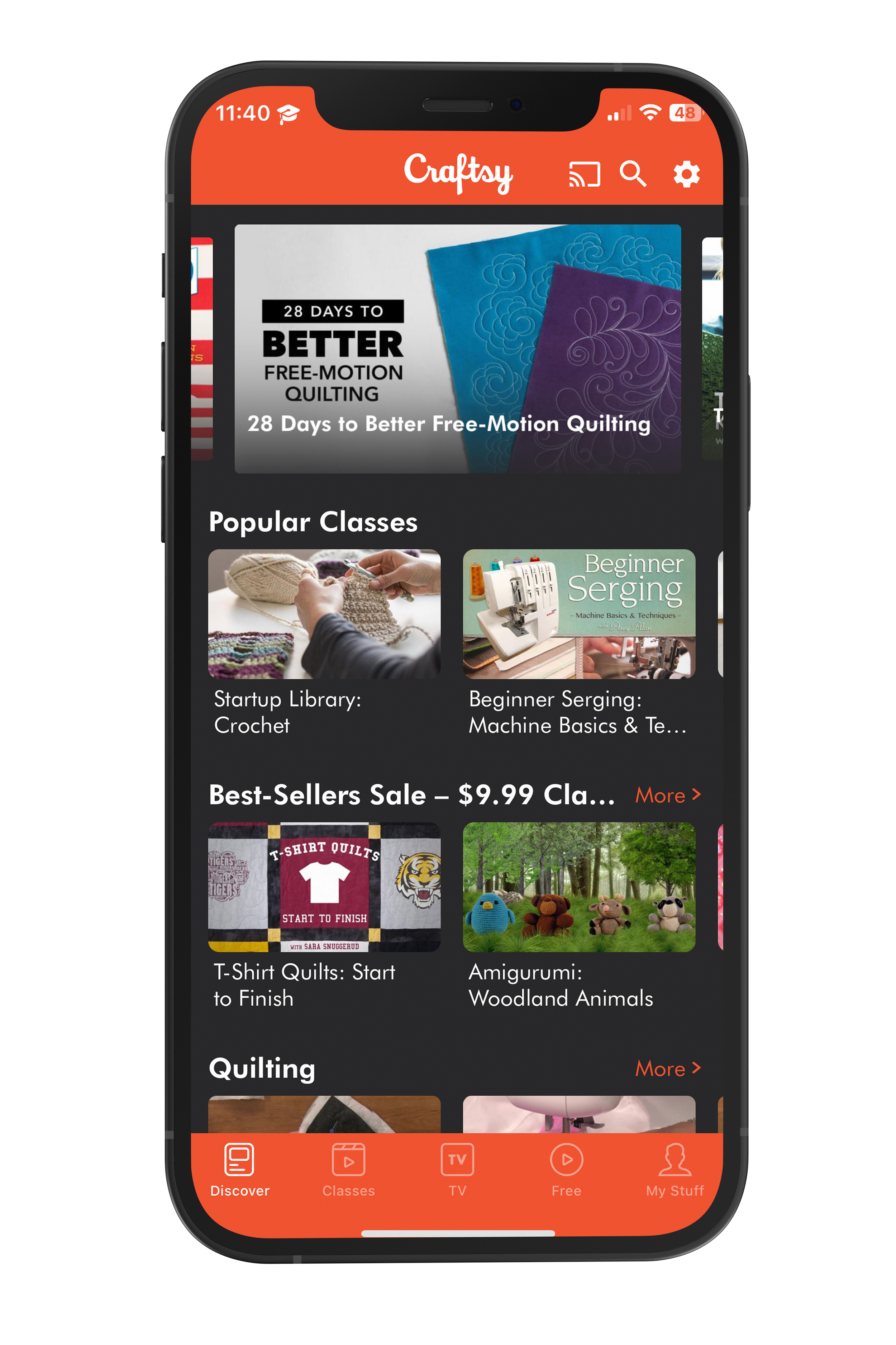
I researched several e-learning apps to develop a user-focused learning experience with improved UI/UX design.

-
I appreciate the user-friendly layout of the feed and how easily users can scroll through content, but I find that it mostly consists of images or videos with minimal context. (Screen shown here)
I particularly liked the moving images in the background on the splash screen, but I felt it might be overwhelming.
A helpful search page that suggests content, provides additional suggestions and enables filtering.
Search results for tutorials mostly consist of short videos, these videos may be difficult to follow along with and lack depth.
Provides multiple paths to add a new pin, which is intuitive and user-friendly.
The user flow for uploading a pin is comprehensive, yet not overwhelming, by condensing information and guiding the user through various steps.
-
The home/browse screen has categorized content with short titles, but I find the scroll bars less user-friendly on mobile devices. (screen shown here)
The opening screen felt both empty and crowded at the same time.
Only permits email sign-up/sign-in, not social account sign-in.
The search page is blank and does not give suggestions, results are not very accurate.
Craftsy offers more comprehensive tutorials but many of them are paid
Free tutorials are available but cannot be searched specifically.
Free content can only be browsed.
Does not allow for user uploads.
Offers a PDF version of tutorials, but downloading them requires many steps and routing to a third-party site
TARGET AUDIENCE
After conducting my research, I determined who my core audience would be and what the main tasks were that they would be able to complete.

WHO is using Muse?
Anyone who is looking for a forum to find and share crafting inspiration and tutorials.
WHAT kind of tasks will users complete as they use the app?
Contribute- share projects and tutorials
Search for projects- save/share/follow tutorials
WHEN & WHERE will my audience use the app?
Looking for crafting ideas or following tutorials.
To share a project and tutorial.
Users can browse from anywhere- on the road or at home in their craft room.
Primarily they will use this app when they are searching for a project or following along with a tutorial.

User Flow
Once I completed my research and determined my target audience for Muse, I crafted a user flow that resonated with their specific needs and preferences.

Low-Fidelity Wireframes
After finalizing the user flow, I proceeded to sketch low-fidelity wireframes to visualize the app's layout and interactions.

Mid-Fidelity Wireframes
After sketching low-fidelity wireframes, I proceeded to create mid-fidelity wireframes, refining the layout and incorporating more specific design details to strike a balance between simplicity and functionality.


Style Guide
After sketching low-fidelity wireframes, I carefully determined the overall aesthetic to create a visually captivating and cohesive design.

Poppins

Gloria Hallelujah

HEX: #006A67

HEX: #4A6362

HEX: #FFB951

HEX: #BA1A1A

HEX: #191C1C

HEX: #FFFFFF
High-fidelity Wireframes
Once the style guide was established, I applied the design elements and principles to create high-fidelity wireframes, bringing to life the visually polished and consistent user interface for the Muse app for both iOS and Android.


Prototyping
To transform the vision of Muse into a tangible reality, I created high-fidelity prototypes for both iOS and Android.
My goal was to create a seamless and engaging user experience that catered specifically to the needs of aspiring artists.
The high-fidelity prototypes brought Muse to life, showcasing its vibrant and intuitive interface.

User Testing
The goal of this round of testing for Muse was to assess the overall user experience both as a new user and an existing user. I observed how users interact with Muse to assess how easily users can complete basic tasks such as creating an account, signing in, browsing projects, adding a new project, saving projects, sharing projects, etc.
Below you can see the results of my user testing.
Error Rating Scale
0 = I don't agree that this is a usability problem at all
1 = Cosmetic problem only: need not be fixed unless extra time is available on the project
2 = Minor usability problem: fixing this should be given low priority
3 = Major usability problem: important to fix and should be given high priority
4 = Usability catastrophe: imperative to fix before the product can be released
Overall this round of User Testing was successful!
Most users found everything to be very easy to navigate and intuitive on the first use.
I determined common issues amongst all testers, and I made design changes to eradicate these issues in the future.
Revisions
After conducting user testing and analyzing the data, I made necessary design changes to optimize the app's usability and overall user experience.
I implemented the following design changes: added back buttons where applicable for improved navigation, increased the text size of cards for better readability, and restructured the layout of the profile page content to simplify the user experience.

Original screens


Final screens


Final Product
I am thrilled to showcase the final product of Muse!
Through an iterative design process, meticulous attention to user flow, and thoughtful incorporation of user feedback, the app has evolved into a comprehensive and visually captivating e-learning platform for aspiring artists. From low-fidelity wireframes to high-fidelity prototypes, each step of the design journey contributed to the creation of an intuitive and engaging user interface.
The final product of Muse represents a culmination of efforts, resulting in an e-learning art app that empowers users to unlock their creative potential and embark on an enriching artistic journey.
Thank you
Thank you
PROJECT ROLE & TOOLS
MARKET RESEARCH
|
COMPETITIVE ANALYSIS
|
USER INTERVIEWS
|
USER PERSONAS
|
USER FLOW
|
PROTOTYPING
|
USER TESTING
|
WIREFRAMES
|
STYLE GUIDE
|
INTERFACE DESIGN
|
MARKET RESEARCH | COMPETITIVE ANALYSIS | USER INTERVIEWS | USER PERSONAS | USER FLOW | PROTOTYPING | USER TESTING | WIREFRAMES | STYLE GUIDE | INTERFACE DESIGN |
In conclusion, this case study represents the journey of bringing Muse to life—a dedicated e-learning art app designed to ignite creativity and empower aspiring artists. From meticulously mapping out the user flow to crafting low-fi wireframes, conducting user testing, and implementing design improvements, every step was taken to ensure a seamless and engaging user experience. The final product stands as a testament to the power of iterative design and user-centric approaches, providing a comprehensive platform for artists to flourish.
Thank you for taking the time to view my case study! If you have any feedback or are currently seeking a designer, please don't hesitate to get in touch. I would love to hear from you and discuss any potential collaboration opportunities.
